CSS Flexbox Playground & Generator
Visually build a flexbox layout and get the generated CSS · free, no signup
See CSS Flexbox Playground & Generator in action
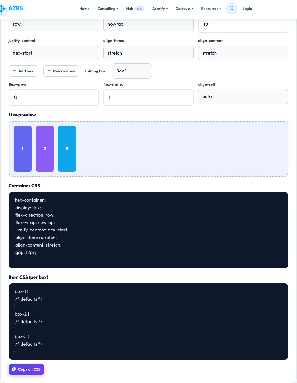
Free CSS Flexbox Playground & Generator
Flexbox properties like justify-content, align-items and flex-wrap are easy to mix up because their effect depends on the flex-direction, and it is hard to picture the result just from property names. This playground shows a live row of coloured boxes inside a container, and every control you change — direction, wrap, justify-content, align-items, align-content and gap — updates the layout instantly so you can see exactly what each property does.
Once the layout looks right, the exact CSS for the container is generated automatically, ready to copy into your stylesheet. You can also add or remove boxes and adjust an individual box's flex-grow, flex-shrink and align-self to understand how item-level properties interact with the container's settings.
Key features
Live visual layout
See real boxes rearrange as you change any flexbox property.
All major properties covered
Direction, wrap, justify-content, align-items, align-content, gap.
Per-item controls
Test flex-grow, flex-shrink and align-self on individual boxes.
Copy-ready CSS
Generated container and item CSS, ready to paste.
How to use it
- Adjust flex-direction and flex-wrap first to set the overall flow.
- Try different justify-content and align-items values and watch the boxes move.
- Add or remove boxes, and adjust individual box properties if needed.
- Copy the generated CSS into your project.
Worked example
Example
direction: row, justify-content: space-between, align-items: center, gap: 16px → display:flex;flex-direction:row;justify-content:space-between;align-items:center;gap:16px;
Who uses this tool
Front-end developers
Prototype a layout visually before writing CSS by hand.
Students learning CSS
See cause and effect for every flexbox property in real time.
Designers who code
Communicate exact spacing and alignment with working CSS.
Tips for the best results
- Remember justify-content works along the main axis and align-items along the cross axis — they swap roles when you change flex-direction.
- Use gap instead of margins on flex items for spacing — it avoids extra margin on the first and last item.
- flex-wrap: wrap is needed before align-content has any visible effect, since it only matters across multiple lines.
- Test with different numbers of boxes; some property combinations only show their real effect with 3+ items.
Common mistakes to avoid
- Expecting align-items to control horizontal spacing when flex-direction is row — that's justify-content's job.
- Forgetting flex-wrap: nowrap is the default, which can cause items to shrink unexpectedly instead of wrapping.
- Setting flex-grow on an item without also considering flex-basis, leading to unexpected sizing.
Why use AZRS QuickFix?
It is 100% free, needs no signup and has no watermark or usage limits. The tool runs in your browser, so what you type stays on your device, and it works on phones, tablets and desktops. New tools are added every week — bookmark this page or browse the full QuickFix toolbox.
Frequently asked questions
What's the difference between justify-content and align-items?
justify-content aligns items along the main axis (the direction set by flex-direction), while align-items aligns them along the cross axis (perpendicular to it).
Does this work for CSS Grid too?
No, this is specifically for flexbox; grid-template-columns and related grid properties work differently and aren't covered here.
Can I copy CSS for individual items, not just the container?
Yes, each box has its own flex-grow, flex-shrink and align-self values shown alongside the container CSS.
Is flexbox supported in all browsers?
Yes, flexbox has full support in all modern browsers and has for many years.
What does gap do compared to margin?
gap adds spacing only between items, not around the outer edge, avoiding the classic extra-margin-on-the-last-item problem.
Is my layout data saved?
No, this is a live playground only; copy the generated CSS before leaving the page if you want to keep it.