Color-Blind-Safe Palette Generator
Generate a set of colors that stay visually distinct for protanopia, deuteranopia and tritanopia, not just for typical vision · free, no signup
How Color-Blind-Safe Palette Generator works, step by step
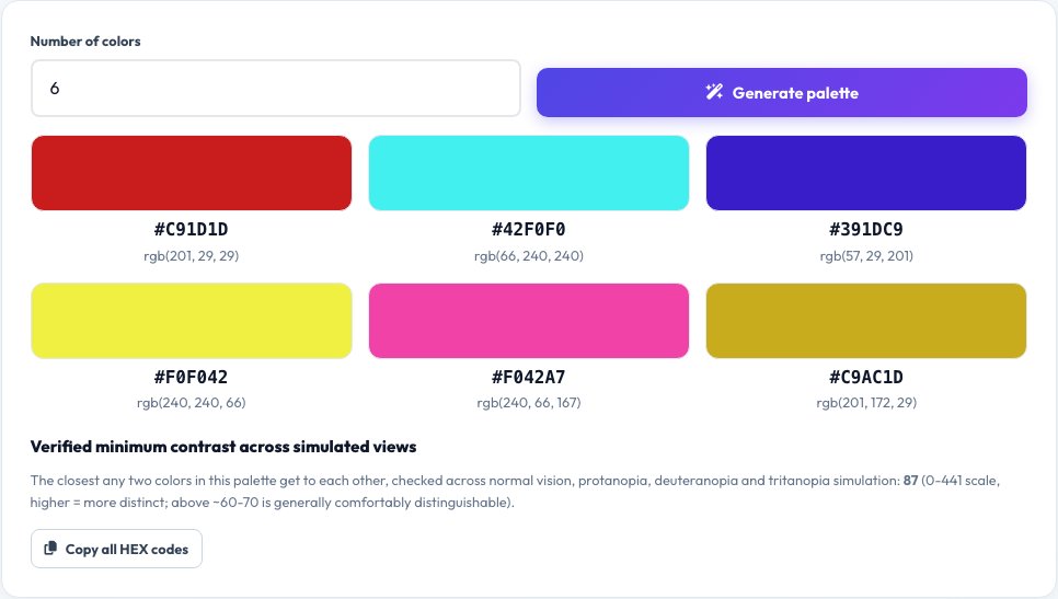
Choose how many colors you need (3 to 12).
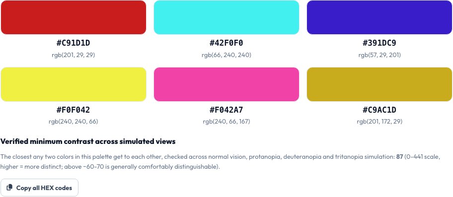 Download it
Click generate.
Color-Blind-Safe Palette Generator
Picking colors that look distinct to you is not the same as picking colors that stay distinct for the roughly 1 in 12 men and 1 in 200 women with a color vision deficiency. This tool generates a palette by sampling many candidate hues, running each candidate through real color-vision-deficiency simulation matrices for protanopia, deuteranopia and tritanopia (the three common types), and keeping only the set whose pairwise color difference stays high across all three simulated views, not just normal vision.
This is the opposite job of a colorblind simulator, which shows you how one image looks to colorblind viewers — this tool instead generates new colors from scratch that are verified in advance to survive that simulation, so you can use them directly in a chart, a map legend or a UI without needing to test them afterward.
Key features
Real CVD simulation math
Each candidate color is transformed through real protanopia, deuteranopia and tritanopia simulation matrices, not a rule of thumb.
Verified pairwise distance
Colors are only kept if they stay perceptually distinct from every other color in the palette under all three simulated conditions.
Choose palette size
Generate anywhere from 3 up to 12 distinct colors for charts, categories or map legends.
Copy-ready hex codes
Every generated color is shown with its HEX and RGB value, ready to paste into your design tool or CSS.
How to use it
- Choose how many colors you need (3 to 12).
- Click generate.
- The tool samples and filters candidate colors using real color-vision-deficiency simulation.
- Copy the HEX codes of the resulting palette, verified to stay distinct for all three common color vision deficiencies.
Worked example
Example
Requesting 5 colors returns a palette like #0072B2, #E69F00, #009E73, #CC79A7, #56B4E9 — each pair stays visually distinguishable when simulated for protanopia, deuteranopia and tritanopia, unlike a naive rainbow palette where red and green (or blue and purple) collapse into a similar shade for many colorblind viewers.
Who uses this tool
Data visualization designers
Build charts and graphs whose categories stay readable for colorblind viewers, not just typical vision.
Product and UI designers
Choose status colors (success/warning/error, category tags) that remain distinguishable for all users.
Cartographers and map-legend designers
Pick a legend palette that doesn't collapse into ambiguous colors for a meaningful share of viewers.
Tips for the best results
- Never rely on color alone to convey meaning even with a safe palette — pair color with a label, icon or pattern for full accessibility.
- Red-green confusion (protanopia/deuteranopia) is far more common than blue-yellow confusion (tritanopia); this tool checks all three, which is stricter than tools that only check for one.
- A palette safe for 5 colors may need to shrink for 8+ categories, since more colors packed into the same hue range are harder to keep simultaneously distinct — try a smaller count if colors look too similar.
Common mistakes to avoid
- Using a default 'rainbow' or red/green palette for a chart, which is one of the most common colorblind-inaccessible choices.
- Assuming a palette that looks fine to you personally is automatically colorblind-safe — always verify with real simulation, not personal judgment.
- Packing too many categories into one chart even with a safe palette — beyond about 8-10 colors, any palette becomes hard to tell apart for everyone, colorblind or not.
Why use AZRS QuickFix?
It is 100% free, needs no signup and has no watermark or usage limits. The tool runs in your browser, so what you type stays on your device, and it works on phones, tablets and desktops. New tools are added every week — bookmark this page or browse the full QuickFix toolbox.
Frequently asked questions
How is this different from a colorblind simulator?
A simulator (like this site's Color Blindness Simulator) shows you how an existing image looks to colorblind viewers. This tool does the opposite — it generates brand-new colors from scratch that are already verified to stay distinct under that same simulation, so you don't have to test and redesign afterward.
What color vision types does it check?
Protanopia and deuteranopia (the two red-green types, together affecting the large majority of colorblind people) and tritanopia (the rarer blue-yellow type) — a palette is only returned if it stays distinct across all three.
How many colors can I generate?
Between 3 and 12 — fewer colors can be spaced further apart and stay more reliably distinct; if 12 colors look too close together, try a smaller count.
Is this palette also fine for people with normal color vision?
Yes — colors verified to stay distinct under color-vision-deficiency simulation are, in practice, also clearly distinct for typical vision.
Can I use these colors commercially?
Yes, the generated HEX/RGB values are just numbers — use them freely in any project.
Is my data stored?
No, palettes are generated locally in your browser.